Motivation
In Machine Learning, all types including supervised, unsupervised and reinforcement learning have their own way of implementation. Let’s do hands-on with them;
Supervised Learning
It’s the “Task Driven” (Predict next value). Here, we teach the model! then with that knowledge, it can predict unknown or future instances.
Let’s implement the simple code in the jupeter notebook (You may use any appropriate editor or IDE as per your ease).
- Linear Regression
Lets first import all the required modules that we need. Simply import “Matplotlib” library, pyplot, “numpy”, “Scikit-Learn” and linear model uses the data sets that we have to perform linear regression.
Once the import is complete, now simply load the dataset, for now just simply load directly to arrays;
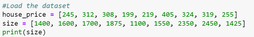
Here, we can see the loaded data is like in XY plot through which we can apply the linear regression.
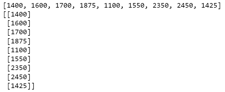
Now simply reshape the input to our regression;

Here, we gonna reshape to however we want to see the data from the array;
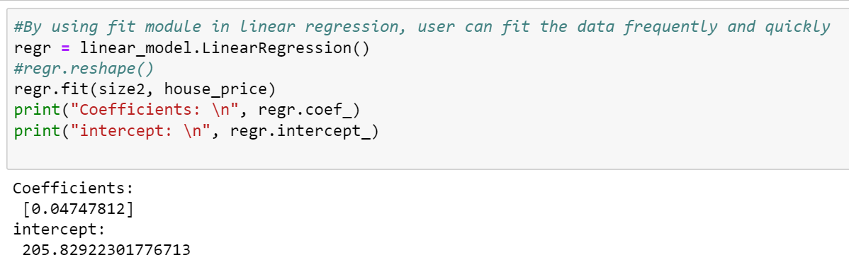
Now, it will simply print the coefficient and intercepts;
Now by using the data, we can easily calculate the coefficient and intercept;
Let’s calculate or predict the price accordingly if the size is 1400. It will predict the price of the house accordingly.

Now, let’s visualize what we are getting;
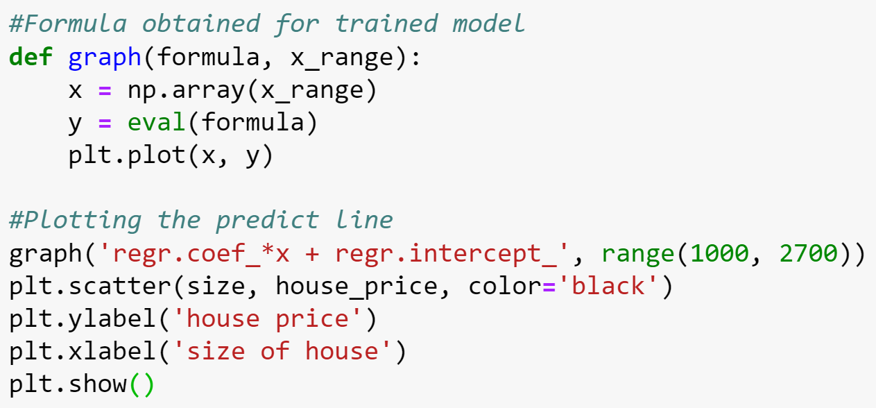
That will create the visualization graph for us;

Unsupervised Learning
Its data-driven (identify clusters). Here, we do not supervise the model, but we let the model work on its own to discover information that may not be visible to the human eye.
K-means clustering;
Here, we have a number of steps;
- First, we need to randomly initialize two points called the cluster centroids.
- Now, based upon the distance from the orange cluster or green cluster centroid, it will group itself into the particular group.
- Move Centroids – Now, we will take the two cluster centroids and interactively reposition them for optimization.
- Repeat the previous two steps iteratively until the cluster centroids stop changing their positions and became static.
- Once the cluster becomes static then the k-means clustering algorithm is said to be converged (done). (Hence we can start testing it)
Let’s do the hands-on;
Simply Import Numpy, Matplotlib, and skilearn libraries and load the static data to visualize a graph

Now, the next step is to convert the data to NP or Numpy array. This time instead of shaping it, simply load it in [].

In the next step, we can go ahead and create our cluster variable and in this case, we put a call that k-means all lower case and that assign with Kmeans which is the module we brought in and we simply send a variable “n_cluster”. And we are looking to make 2 clusters, so we will simply assign it to 2. (As there is a challenge when working with K-means, that guessing how many clusters we want, that’s why it’s always nice to plot the data first hence we can guess how many clusters we want and set it accordingly). At last, simply use kmeans.fit(X), that would take our X data, plot it and fits it to k-means and create those different pieces of data we are looking for.

So, now we will set a variable called centroid and we can set it equal to our k-means variable “kmeans.cluster_centers_”, that’s the part of the k-means module, we have clusters centers and we have labels so we can create our both our centroids and our labels. Hence we can print our centroids and labels like here;

- Here, we can see in the output, the first centroids located at 1.16666667, 1.46666667, that’s where the first point is and the second is at 7.33333333 and 9.0.
- And then the labels that tell it each of those different pieces of data we put in. It says which centroid that’s going to go with, so here the first one is 0 then the 1, 0, 1, 0, 1, and that’s how its group those different points of data.
Now, let’s print the clusters on to a graph. So let’s visualize the output.
Here, we would apply colors. Then use the loop to go through the range of the length of X, so we can see each of the X variables, then we print the coordinate and the label, so we know which coordinate goes with which label and then we actually going to plot them for each one we’re gonna add that to the plt plot and finally to see where those centroids are, we’re also going to add the scatter plot and put the two centroids on those plots. At the end we will simply show it;
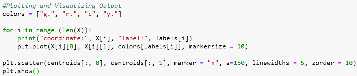
It will visualize a nice graph for us with coordinates and labels;

Conclusion;
So you see, how cool is to play with libraries and stuff in Machine Learning. One can perform amazing things by using this. Like by using just a few lines of code we have performed clustering and other things very easily.